
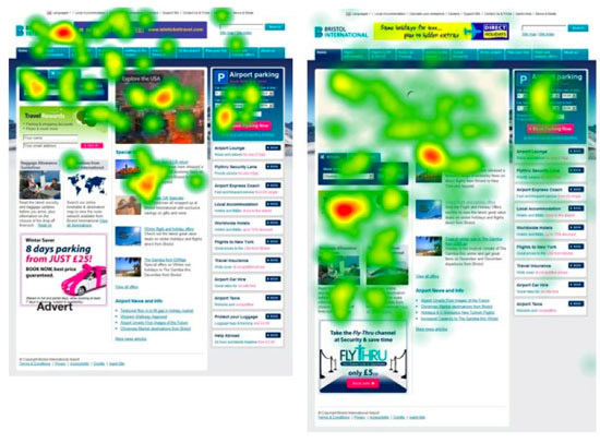
The eye-tracking study is the lens all business owners keep firmly in sight; they just love it! After all, it shows how your customers look, browse and spend time on your website.
It’s one of the key factors that’s always taken into account when you plan to modify your business appearance and is constantly looked at for improvement. In fact, it takes the lead most of the time and decisions on what’s going on the website and what not are generally based on user behavior.
You just don’t have to make guesses on what’s going to work as you have staggering data from eye-tracking software and heat maps to help you in optimizing conversion rates at a rapid pace.
We have compiled the most significant eye-tracking studies all marketers should be aware of to give them the idea of user’s browsing behavior, the elements most closely looked at for optimizing the website conversions.
1. No More Dead Weight Visuals!
Visuals carry weight too, and they need to be incorporated on the page in a manner that they play a vital role in achieving the targeted objective; if not, it’d completely be the other way around. Fitts’s law, however a bit complicated at first instance, explains how object’s weight in the visual scheme of things, influence user’s attention, and eventually clicks.
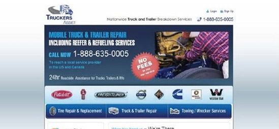
Take a look at this case study of a Truck service company’s homepage with a heat map.
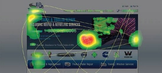
It is quite evident that the ‘NO FEES’ button right in the center is catching the eye and the heat map confirms that too. This button isn’t clickable, and it’s just information, although important but not the primary objective and a point of conversion.
In fact, the phone number right next to it is the targeted goal which is dampening due to the added weight on the ‘NO FEES’ button, and other elements aren’t given the required attention. They modified though to solve this and here’s what they came up with.

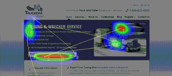
The ‘Call Now’ button on the updated homepage is the focal point now compared to any other element on the page, ensuring users fulfill the targeted objective, i.e. call the business and get things started.
Takeaway: While getting your landing page designed, one has to make sure that elements are given weight as per the business goal they carry and things that aren’t that important shouldn’t be stressed upon too much.
2. Videos Maneuver Search
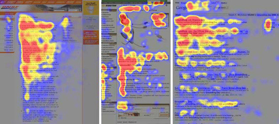
Search marketers constantly monitor the search results in heat maps, with the top 3 results having the densest cloud building over them. Videos, too play a vital role in making users stay and click on their search result.
In a recent study by Moz, it was clearly evident that videos captured the user eye specifically for terms that involve some sort of process that needs to be looked at rather than read even when the result isn’t the top-ranked.
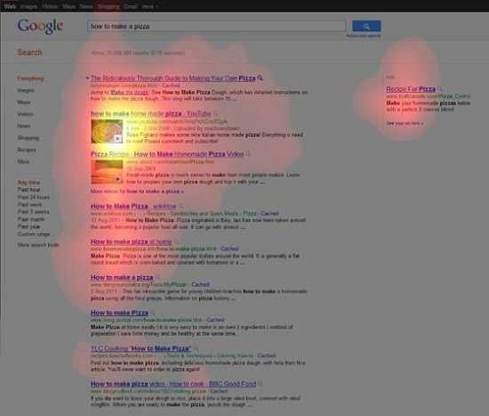
Now, for a search term ‘How to make a pizza’ the regular search listing, even though top-ranked isn’t given any attention and surfers gather around the hosted YouTube video result ranked second and also on the embedded video result ranked third.
Google Authorship is a way you link your own created content with a Google Plus profile you choose. But, it isn’t that simple, and it can hurt your website’s traffic somehow or the other if not done correctly. Specifically for the product pages, if associated authorship account has photos, people would naturally assume that it’s an article or a blog rather than a product page making your lives extremely difficult.
For videos, it’s the other way around, and a general perception about them is they are product oriented and therefore receive considerable clicks.
Takeaway: Instead of associating authorship to your product pages, try an embedded video on the page and see how it performs to outrank your search competition.
3. Show Them The Way!
Visual cues aren’t something out of the box and are being used for some time now but to use it to the most effective manner is something that needs to be looked at.
Numerous studies are concluding the human tendency to follow the directions or look at where everybody’s looking and this is something that comes naturally to individuals.
Here’s an example of a page that sells baby care products having a picture of a baby and an intriguing headline.

Obviously, most users will look at this cute baby but do you want them to just peek at the baby and go? Surely not! So, what are you going to do as your page copy isn’t getting the required attention?
The baby would surely help! Turn the baby sideways looking at the copy, and the results would astound you.
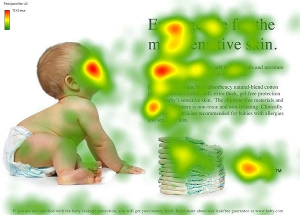
The visual patterns started to shift, and users followed where the baby was looking, and the web copy was started to receive the attention it deserved.
Takeaway: Integrating visuals in your web content is very important but arranging them in an orderly manner for users would ensure, you make them see what needs to be seen!
4. Following The ‘F-Pattern’ Footsteps!
The F-pattern reading is something most people are aware of but not many people know that this reading pattern is also a looking, a visual and a browsing pattern too.
Surveys conducted over articles, e-commerce websites and SERPs, and it was unanimously concluded that the browsing patterns of users followed the F-pattern with major focus geared on the left of the screen.
The left side of the screen is viewed and hovered upon quite more as compared to the right side as indicated by the graph below:
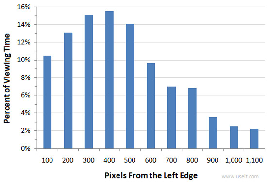
It should be noted that this pattern applies to the English linguistics and reverse case scenario was true for the reading patterns of language that went from right to left.
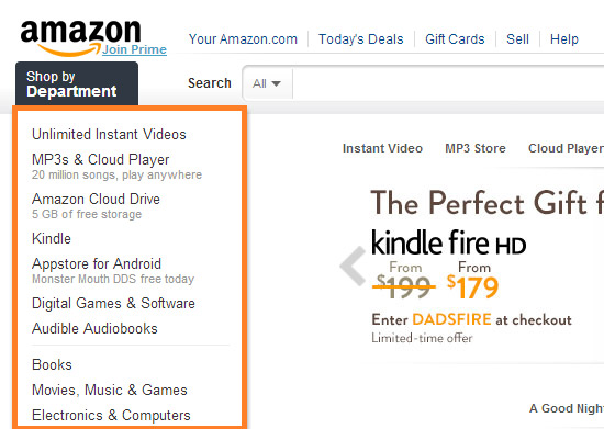
That’s why we see some of the top brands around the world keep their left sidebars for their best sellers.
Have a look at Amazon for instance!
Takeaway: Browsing patterns too, follow the reading pattern of the language and if your targeted audience speaks English, then the left side of your web page holds the most vital position and elements need to be arranged keeping the F-pattern in sight.
5. Don’t Over-Emphasize The ‘Fold’
Crowding the screen above the fold is something most webmasters tend to think of it as the only place where users would draw their attention, which isn’t true at all. If users find your product interesting, they would have no problem going down the fold. It’s erroneous to overcrowd the fold and isn’t a good idea as indicated by heat map below.
Too much content is not a bad idea as long as it’s intriguing and fulfilling the purpose. This A/B test on the length of the content found that web copy that had more than 1200 words was more converting than the one with just 488 words and the quality of conversions coming from the former was relevant and more targeted compared to the latter.
Even taking your call to action deep down just above the footer also encouraged more conversions and beat the nearby fold CTA page by 304%.
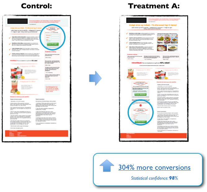
Takeaway: The important elements on the webpage shouldn’t be necessarily crowded around the fold. They could be placed below the fold to give your copy the requisite attention making users read what you’ve written taking action afterward!
6. Thin Newsletters Is The Way To Go!
Eye-tracking and Email Marketing have a very great relationship, and the way users behave with their emails has been the gist of most eye-tracking studies.
Several studies are depicting the behavior of users upon their emails but one thing that stands out among the rest is the average time spent on headlines and initial phrases which far greater than any other place of the email. People skim and scan their emails and are mostly interested in the subject and first few lines of the email.
People go through their inbox and newsletter emails don’t get even a minute of user’s reading time, studies suggested. This indicates email marketing geniuses have to be concise and very clear about their subject and what they intend to promote. The message should also compel the audience just like articles, and you want them to perform the desired action, both at the same time, but the margin is far too low in emails compared to articles.
It goes without saying that everybody loves short, concise and to the point messages without bragging of any sort. Even the creative subject lines and peculiar headings that make people curious about anything isn’t the way to go when it comes to emails as these are all dragged in the category of spam. Therefore, most of them go unopened.
Takeaway: Getting into the inbox of a potential prospect in an absolute privilege and to continue enjoying these privileges one has to keep their email short, concise and making point as you don’t have considerable time and space to transmit the message, that you’d probably have in distributing an article online.
7. Mention Pre-Sale Prices
When it comes to buying goods on sale, people want to know how much are they saving. This is a general phenomenon that applies to all channels be it physical or digital. Customers are interested in knowing what the previous price of the product was and how merciful is the shopkeeper. You don’t need to sell the product at that price, and it shouldn’t necessarily be the old price of the product.
What needs to kept in mind is the fact that people don’t pay that price, but if they see huge discounts being offered, they tend to buy something out of the lot.
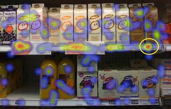
Here’s an experiment conducted on how consumers look at the prices of products on store shelves.
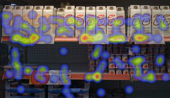
In the image above, it is noticeable that users spent time looking at the price tagged area of the shelves, but the results just got multiplied when pre-sale prices were included. Take a look!
Now, the pre-sale cut-off prices are the areas people focused the most although they won’t be paying it, but the feeling of saving a whole lot and all those calculations go through their minds while they are looking.
THINK EYE’s Robert Stevens conducted an experiment to see what user perceive when the see sale prices and reductions, and he asked a sample size of people to rate the smoothie they bought on a scale of 1 to 7 with one being the best and seven being the worst.
Those who saw just the item without looking at the cut-off discount gave an average of 2.4 for the smoothie whereas the ones who saw full-price premium offer along with promotional product scored 1.7 for the smoothie on average.
That’s amazing, isn’t it? Both have bought the same smoothie, and still, they rate it differently, as they are under a price influence. Price is basically one of the parameters to evaluate products and users base their decisions upon it. If we get to know what the actual price of the product without promotion was and what’s it actually selling for, we tend to buy it and is right up there in our ratings.
Takeaway: These price reductions and pre-sale price gig can be of great significance to influence users in buying a particular product. They love to shop and save at the same time, and the feeling of saving quite a few bucks would surely make them buy your product again.